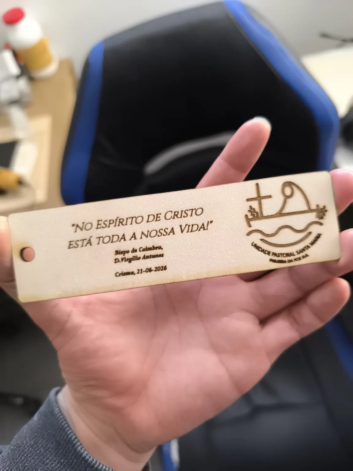
Typographical penance
Just last month, a commission came in for several plaques:
In the spirit of Christ is all our life.
Confirmation 2026 + the parish logo.
The work turned out nicely. The problem wasn't the phrase, Confirmation, the logo or repeating the engraving twenty times.
The problem was the plaques.
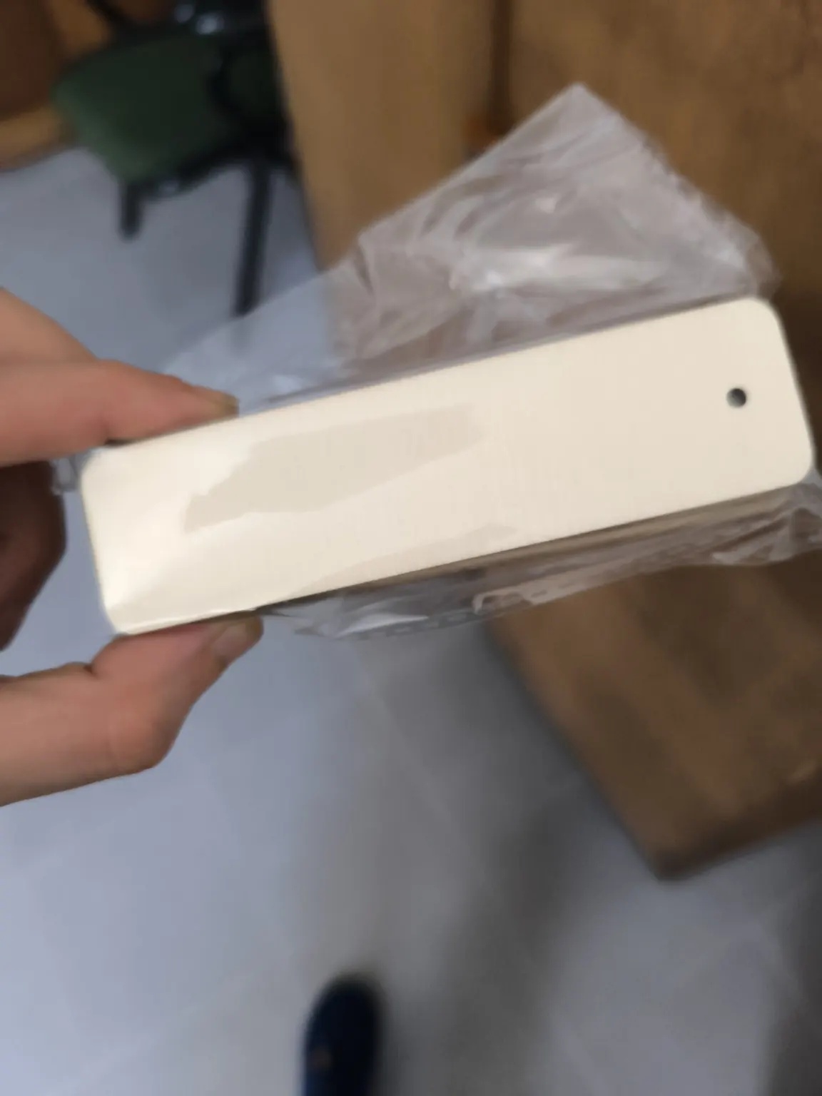
Twenty little sanity tests
The plan was to supply plaques already cut into long, narrow shapes: roughly the geometry of a toothpick with ambitions.
Positioning one perfectly straight in the machine is possible. Positioning twenty, one at a time, and guaranteeing precisely the same alignment belongs to another profession.
I engrave with a laser. I'm no ninja at positioning plaques.
A tiny difference in position quickly turns an organised series into a procession of slightly tilted sentences. Then nobody wants to hear that the wood decided to seek its own spiritual path.
There was also the parish logo. At that size, engraving the lettering was less graphic design and more religious microfilming. Any narrower, and the quote would have needed twenty magnifying glasses as reading accessories.
Engrave first, cut afterwards
The solution was to decline the precut plaques and use an approach that didn't depend on supernatural powers: lay everything out on a larger piece, engrave with controlled alignment, then cut the plaques.
The laser repeats positions far better than I can balance twenty toothpicks. It's not a lack of faith. It's an excess of experience.
The result
The plaques came out straight, the work looked good and nobody had to watch an adult spend an afternoon aligning thin wood.

I'll engrave the same phrase twenty times. Just don't ask me to pretend that positioning twenty narrow plaques by hand is precision control.
Even on a Confirmation commission, faith doesn't replace a good jig.